


:::::::::::::::::::::::::::::::::::::::::::::::::::::::::::::::::::::::::::::::::
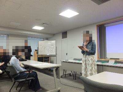
《 今回のworkshop 》
○workshop参加人数:59名(うち新人の方:5名)
○【前半】:Let’s think about promotion of paperless life!
○【後半】:Color Theory
:::::::::::::::::::::::::::::::::::::::::::::::::::::::::::::::::::::::::::::::::
【前半】
Title:
Let’s think about promotion of paperless life!
Introduction:
In my office, we have tried to reduce the usage of papers in terms of efficiency, cost-saving and resource conservation. However, it’s difficult to quit the usage of papers completely, and we use both paper documents and digital documents in many situations.
On the other hand, in my private life, I started to use digital books and a digital schedule book instead of paper ones. They’ve been very convenient and suitable for me so far.
In addition, I saw the interesting news that MEXT (Ministry of Education, Culture, Sports, Science and Technology-Japan) started to promote the usage the digital textbook in elementary school.
School education Act was revised and came into force from this April. By the revised law, it became possible to use digital textbooks in conjunction with paper textbooks.
So, today I would like to discuss the promotion of paperless life together.
Discussion Questions:
Q1 Is paperless environment set up in your office or school?
If so, please share the examples.
Q2 In your private life, have you introduced paperless goods instead of paper ones?
Please share your cases and reasons you introduced them or not.
Q3 What are merits of introduction of digital textbook in elementary school?
Q4 What are demerits of introduction of digital textbook in elementary school?
What is the good way to compensate for those demerits?
Q5 Based on the discussion in Q3 and Q4, please draw a conclusion about whether MEXT should introduce digital textbook in elementary school or not.
Reference in Japanese:
・文部科学省
「学習者用デジタル教科書の制度化」 http://www.mext.go.jp/a_menu/shotou/kyoukasho/seido/1407731.htm
・日本経済新聞 2019/2/4
「デジタル教科書、健康に配慮を 文科省が活用指針」 https://www.nikkei.com/article/DGXMZO40872410U9A200C1CR8000/
——————————-
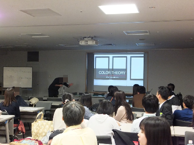
【後半】
Title:
Color Theory
https://1drv.ms/u/s!AlsIuieYpfQmgVtqHS70YCcirmln
Discussion Questions:
・If your life were a film production, which colors do you think would dominate such atmosphere? Please explain why so.
(Please tell the relationship between the color and atmosphere. For example darker colors for gloomy moods, lighter colors for happier moods.)
・What do you remember thinking to yourself the first time you saw the color _ and how did it make an impact on your perspective of harmony?
(In the blank, chairpersons of each tables can choose any color they prefer.)
・Red symbolizes sensuality and purity, yellow (gold) is associated with the gods, and green is a festive color representing life and happiness. How is this so in your culture, or how different are colors represented in your culture?
・What are some colors not to be associated with gifts or special occasions and why? Please give examples of successful situations or unfortunate scenarios.
・Elaborate your thoughts on Hollywood or any other cinematic color manipulation techniques towards their audience.
・Give opinions and elaborate your thoughts on Hollywood or any other cinematic color manipulation techniques towards their audience.
Reference:
In the visual arts, the color theory is a body of practical guidance to color mixing and the visual effects of a specific color combination. There are also categories of colors based on the color wheel.
Although color theory principles first appeared in writings and notebooks of Leonardo da Vinci in 1490, a tradition of “color theory” began in the 18th century.
From there it developed as an independent artistic tradition with only superficial reference to colorimetry and vision science.
The foundations of pre-20th-century color theory were built around “pure” or ideal colors, characterized by different sensory experiences rather than attributes of the physical world. This has led to a number of inaccuracies in traditional color theory principles that are not always remedied in modern formulations.
RGB / CMYK
The tendency to describe color effects holistically or categorically, for example as a contrast between “yellow” and “blue” conceived as generic colors, when most color effects are due to contrasts on three relative attributes which define all colors:
The visual impact of “yellow” vs. “blue” hues in visual design depends on the relative lightness and saturation of the hues.
These confusions are partly historical, and arose in scientific uncertainty about color perception that was not resolved until the late 19th century, when the artistic notions were already entrenched. They also arise from the attempt to describe the highly contextual and flexible behavior of color perception in terms of abstract color sensations that can be generated equivalently by any visual media.
Many historical “color theorists” have assumed that three “pure” primary colors can mix all possible colors, and any failure of specific paints or inks to match this ideal performance is due to the impurity or imperfection of the colorants. In reality, only imaginary “primary colors” used in colorimetry can “mix” or quantify all visible (perceptually possible) colors; but to do this, these imaginary primaries are defined as lying outside the range of visible colors; i.e., they cannot be seen. Any three real “primary” colors of light, paint or ink can mix only a limited range of colors, called a gamut, which is always smaller (contains fewer colors) than the full range of colors humans can perceive.
Complementary Colors
For the mixing of colored light, Isaac Newton’s color wheel is often used to describe complementary colors, which are colors which cancel each other’s hue to produce an achromatic (white, gray or black) light mixture. Newton offered as a conjecture that colors exactly opposite one another on the hue circle cancel out each other’s hue; this concept was demonstrated more thoroughly in the 19th century.
A key assumption in Newton’s hue circle was that the “fiery” or maximum saturated hues are located on the outer circumference of the circle, while achromatic white is at the center. Then the saturation of the mixture of two spectral hues was predicted by the straight line between them; the mixture of three colors was predicted by the “center of gravity” or centroid of three triangle points, and so on.
According to traditional color theory based on subtractive primary colors and the RYB color model, yellow mixed with purple, orange mixed with blue, or red mixed with green produces an equivalent gray and are the painter’s complementary colors.
These contrasts form the basis of color contrast: colors that appear together will be altered as if mixed with the complementary color of the other color. A piece of yellow fabric placed on a blue background will appear tinted orange, because orange is the complementary color to blue.
However, when complementary colors are chosen based on definition by light mixture, they are not the same as the artists’ primary colors. This discrepancy becomes important when color theory is applied across media.
Digital color management uses a hue circle defined according to additive primary colors (the RGB color model), as the colors in a computer monitor are additive mixtures of light, not subtractive mixtures of paints.
One reason the artist’s primary colors work at all is due to the imperfect pigments being used have sloped absorption curves, and change color with concentration. A pigment which is pure red at high concentrations can behave more like magenta at low concentrations. This allows it to make purples that would otherwise be impossible. Likewise, a blue that is ultramarine at high concentrations appears cyan at low concentrations, allowing it to be used to mix green.
Chromium red pigments can appear orange, and then yellow, as the concentration is reduced. It is even possible to mix very low concentrations of the blue mentioned and the chromium red to get a greenish color. This works much better with oil colors than it does with watercolors and dyes.
The old primaries depend on sloped absorption curves and pigment leakages to work, while newer scientifically derived ones depend solely on controlling the amount of absorption in certain parts of the spectrum.
Warm vs Cool
The distinction between “warm” and “cool” colors has been related to the observed contrast in landscape light, between the “warm” colors associated with daylight or sunset, and the “cool” colors associated with a gray or overcast day.
Warm colors are often said to be hues from red through yellow, browns and tans included; cool colors are often said to be the hues from blue green through blue violet, most grays included.
Color theory has described perceptual and psychological effects to this contrast. Warm colors are said to advance or appear more active in a painting, while cool colors tend to recede; used in interior design or fashion, warm colors are said to arouse or stimulate the viewer, while cool colors calm and relax. Most of these effects, to the extent they are real, can be attributed to the higher saturation and lighter value of warm pigments in contrast to cool pigments; brown is a dark, unsaturated warm color that few people think of as visually active or psychologically arousing.
The traditional warm/cool association of color is reversed relative to the color temperature of a theoretical radiating black body; the hottest stars radiate blue (cool) light, and the coolest radiate red (warm) light.
Psychological Stimulation
It has been suggested that “Colors seen together to produce a pleasing affective response are said to be in harmony”.
Color harmony is a complex notion because human responses to color are both affective and cognitive, involving emotional response and judgment. Hence, our responses to color and the notion of color harmony is open to the influence of a range of different factors.
These factors include individual differences (such as age, gender, personal preference, affective state, etc.) as well as cultural, sub-cultural and socially-based differences which gives rise to conditioning and learned responses about color.
In addition, context always has an influence on responses about color and the notion of color harmony, and this concept is also influenced by temporal factors (such as changing trends) and perceptual factors (such as simultaneous contrast) which may impinge on human response to color.
:::::::::::::::::::::::::::::::::::::::::::::::::::::::::::::::::::::::::::::::::
私たちと一緒に英語コミュニケーション能力を鍛えませんか?
ご興味を持たれた方は、
入会申込フォーム
https://english-speaking-club.com/cms/?page_id=93
よりお申し込みください。お待ちしています!
:::::::::::::::::::::::::::::::::::::::::::::::::::::::::::::::::::::::::::::::::
| 01 | E's clubとは・ごあいさつ |
| 02 | サークルの8つのウリ |
| 03 | 学習会の流れ |
| 04 | レベルについて |
| 05 | スタッフ紹介・参加者の声 |
| 06 | 開催報告・過去の題材 |
| 07 | FAQ・会則 |
